Best practices for text accessibility
Tips for reducing (visual) barriers to reading.
Not everyone reads in the same way, not everyone has the same goals when reading a page, and not everyone learns in the same way. Text accessibility oscillates between two extremes: the diverse and elusive experience/needs of the reader and the solid physicality of the publishing industry, both print and digital. Between these two extremes, we experiment and suggest best practices for adapting the form of the text and production processes to different readers.
From this point of view, educational publishing is an exemplary field in which access to information must be guaranteed by graphic designs that respect the principles of inclusivity and accessibility. Identifying and removing obstacles to reading therefore becomes a crucial moment in the design phases of a text, not only in terms of graphics.
Within this context, we carry out projects, consultancies and collaborations to identify the most significant visual variables on which to act in order to make the page more accessible. This is an ongoing process that is constantly updated by empirical evidence, comparisons with the publishing market and, where possible, scientific research and testing.
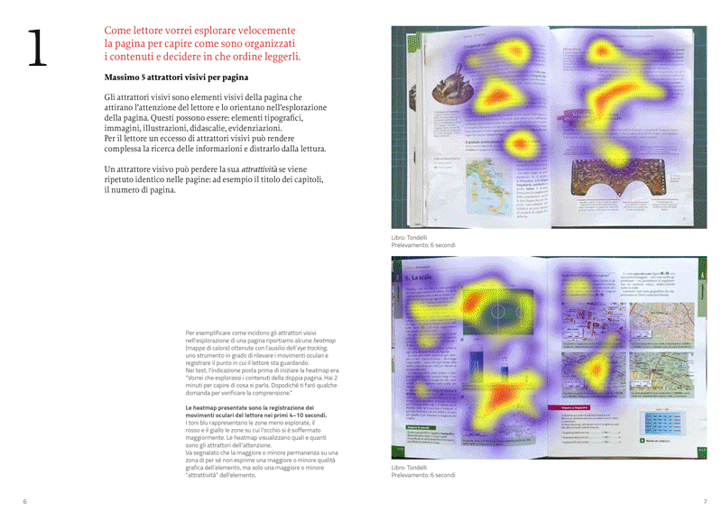
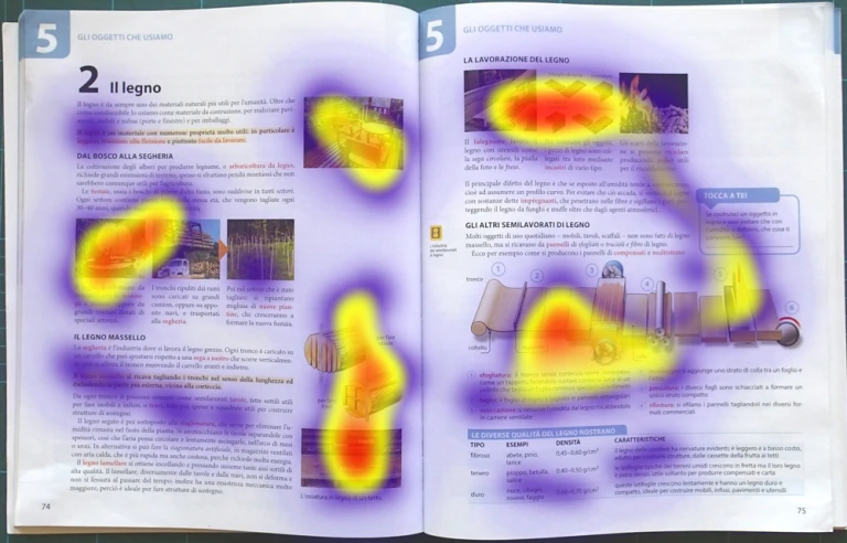
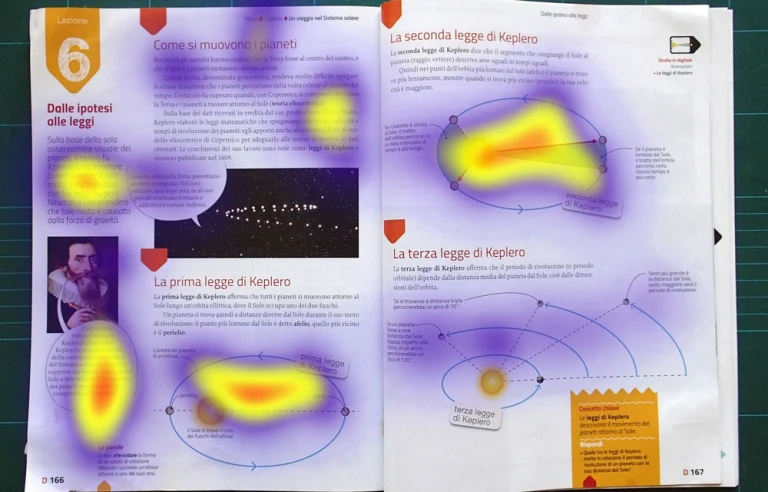
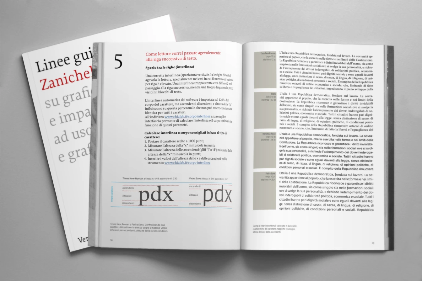
For the publisher Zanichelli, we carried out research/consultancy with the aim of identifying the moments in which to intervene in the editorial process and which visual variables to intervene on: font, line spacing, characters per line, composition, colours and with which parameters. Some of these parameters, the most restrictive ones, were adopted for the “10 in readability” campaign.
The project was supported by Luciano Perondi and the collaboration of ISIA in Urbino.