Print readability and dyslexia
Is there a typeface that helps dyslexics to read?
Access to knowledge is an inalienable right, yet there are almost 200,000 students in Italian schools who have difficulty reading (according to the Ministry of Education, Universities and Research — MIUR — in its paper ‘Integrating pupils with disabilities into schools, academic year 2014/2015’). The typeface would seem to be the first obstacle they encounter. Publishers, students, parents and especially potential readers are asking whether it is possible to overcome this obstacle.
Some publishers have started to ask us graphic designers to use typefaces that make reading easier for dyslexics. We have found out what typefaces are normally suggested and we have done some research into why they are thought to be effective.
We have discovered that there are many typefaces for dyslexics. They all have very different characteristics and, significantly, they are not backed by sufficient testing and documentation.
«Il grafico di fronte al pubblico ha una grande responsabilità. Il grafico che si rispetti deve ritirarsi quando capisce che il prodotto è scadente. Può influire negativamente sullo sviluppo di un bambino, per esempio, o sullo sviluppo culturale della gente. Il progettista grafico dev’essere sempre più orientato scientificamente, non è un venditore di fumo. La sua è una vera specializzazione».
[The graphic designer has a great responsibility towards the public. A good graphic designer must pause when he or she realises that the product is second-rate. It could have a negative effect on the development of a child, for example, or the cultural development of a population. Graphic designers must be ever more scientifically oriented, they are not just selling worthless goods. Theirs is a true specialisation.]
Albe Steiner, Il mestiere di grafico, Einaudi, Torino 1978.
So we began this research together with the ISIA (Istituto Superiore per le Industrie Artistiche) of Urbino and the Life Sciences Department of the University of Trieste. The publishers Zanichelli have shown great interest in supporting the work.
Luciano Perondi, type designer and teacher at the ISIA Urbino, coordinated the team that designed the typefaces to be used for testing readability. Walter Gerbino, professor of Psychology at the University of Trieste, coordinated the team for the experimental project and cognitive tests, comprising the University of Trieste’s Department of Life Sciences, the Burlo Garofalo Pediatric Institute and the National Research Council’s Institute of Cognitive Sciences and Technologies.
Different reading skills or dyslexia?
Walter Gerbino started by explaining the difficulty in defining the field we are researching: ‘When we talk about dyslexia we are almost always referring to ‘developmental dyslexia’ (DD), defined as a specific disorder affecting the learning of written language, attributable to abnormal development of one or more neuropsychological functions involved in the reading process. The widespread use of this label is not universally agreed, as Elliott and Grigorenko explain in their paper The Dyslexia Debate (Cambridge, 2014). Their study refers to a possible ‘diagnostic myth’, more complicated than the simpler idea that reading skills are distributed normally in the population, ‘with a tail end of poor readers inappropriately classified as having a specific disorder.’
Our aim is to understand whether it is possible to make an informed decision on which typeface to use to facilitate reading for the ‘tail end of poor readers’.
Many opinions and few certainties
The typeface is often considered to be the first obstacle that dyslexic readers must overcome to decipher letters. Other typographical variables such as the spacing between letters, words and lines of text or the number of words per line are not usually taken into account.
The typeface bears sole responsibility for helping or putting off the reader.
So much responsibility deserves investigation, to find out whether there are real benefits to be had from using a particular typeface and to understand which visual variables of the typeface can be worked on to improve reading performance.
There is very little research in the literature that isolates the typographical variables that influence the reading process, especially as regards dyslexics.
In general, we have observed that some of the research we have analysed and proposals for typefaces for dyslexic readers lack either typographical knowledge or a sound scientific approach.
The problems most frequently encountered include:
- comparisons made between different typefaces of the same type size, but with obvious perceptual differences
- introduction of visual variables not linked to the design of the typeface (such as leading, letter spacing, hyphenation and set width, i.e. lateral proportions measured by the number of characters per line)
- no distinction between preferences expressed at a glance, ability to read aloud and lexical understanding.
These weaknesses make it very difficult to measure reading performance, since it is not possible to identify the variable that caused the difference. This is where we took our first steps, by setting up a working group with expert knowledge of typography, publishing and cognitive psychology.

Which typefaces to analyse
There are very, very many typefaces, and it is impossible to analyse and compare them all. But the styles of typefaces are limited, and are based on recurring, identifiable typographical models and variables. It was therefore decided to make a selection to get down to a small number of examples, chosen from the ones most widely used and most commonly recommended for dyslexics.
Seven styles of typefaces were selected for testing: seriffed types with thick and thin strokes, seriffed types with extended ascenders and descenders, seriffed types without stroke contrast, roundish sanserifs, squarish sanserifs and dyslexic-friendly types.
The selection of typefaces to be used for the reading tests was based on two different macro groups: typefaces very widely used in publishing (such as Times, Garamond, Verdana, Arial and Helvetica) and those designed and proposed specifically for dyslexics (like Biancoenero, EasyReading, OpenDyslexic and Dyslexie font), often advertised as having ‘high readability’.
The features classified as dyslexic-friendly are generally linked to the asymmetry of the letters, even though this was proved wrong by research back in the 1970s (Fisher, Liberman, Shankweiler, 1978). The asymmetry usually concerns distribution of weight (applied to the F7 type designed specifically for the reading tests) or asymmetry in the design of certain letters, especially groups ‘1’ ‘I’ ‘L’ , ‘p’ ‘b’ ‘q’ and ‘d’ (cf. F2 type).
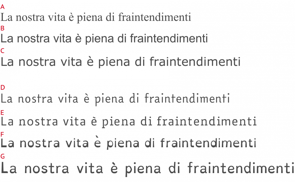
Examples of typefaces widely used in publishing (A, Times; B, Arial; C, Verdana) and typefaces designed for dyslexics: D, EasyReading; E, Biancoenero; F, OpenDyslexic; G, Dyslexie font. Comparing texts set in these types, each of the same type size, means comparing texts that are very different in terms of optical size, visual weight and letter set width.
How to compare typefaces?
Comparing typefaces from different families has intrinsic problems because of the design of the typeface. For example, two texts set with different typefaces of the same type size with different x-heights (the height of lowercase x) will appear quite dissimilar to the reader because of their visual size that is determined by the x-height.
The obvious perceptual differences between the types have to be avoided so not only the x-height, but also the optical weight, the general proportions, the set width and the style of the letterforms should not change.
This delicate operation was carried out by Luciano Perondi, who coordinated the team of type designers from ISIA Urbino in developing a parametric font, that is a design system that makes it possible to generate different fonts from a single master design. Seven fonts were generated, differing in some design variables but sharing the same basic structure (each letter has the same skeleton throughout the different fonts) and the same optical weight (each font has the same ‘colour’ on the page). The master design was modelled on Times New Roman — probably one of the typefaces that people have read the most in their lives.
Indeed the first font, F1, is a seriffed type with stroke contrast (thick and thin strokes), a clone of Times. F2 is a dyslexic-friendly seriffed type with stroke contrast (basically the same as F1 with changes in the shape of some letters, following the custom of dyslexic-friendly types on the market). F3 is a seriffed type without stroke contrast: a monolinear version of F1. F4 is a roundish sanserif, in other words it is like F3 without serifs. F5 is a squarish sanserif, the same as F4 except that all the curves are notably squared. F6 is the same as F1 with extended ascenders and descenders. Finally F7 is a roundish sanserif with unbalanced contrast: it is like F4 with a pronounced and peculiar contrast in the upper part of the letters.
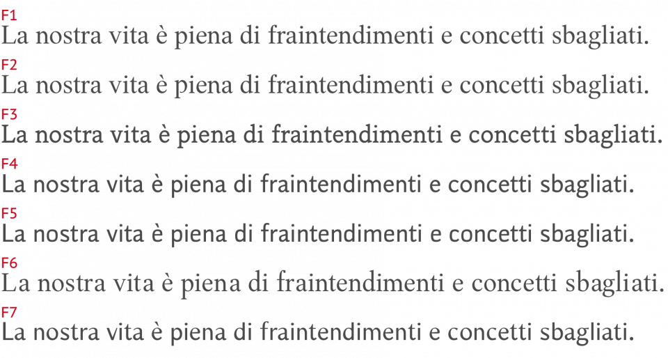
The seven types designed by the ISIA Urbino team for the tests. F1, seriffed type with stroke contrast; F2, dyslexic-friendly seriffed type with stroke contrast; F3, seriffed type without stroke contrast; F4, roundish sanserif; F5, squarish sanserif; F6, seriffed type with longer ascenders and descenders; F7, roundish sanserif with unbalanced contrast
The experimental project
The project to carry out cognitive tests was developed and conducted by the team from Trieste, coordinated by professor Walter Gerbino.
The objectives were to:
- compare the typefaces based on perceived ease of reading
- assess the effect of the perceived ease of the typefaces on various tasks connected with reading
- identify any differences among the three sample groups of participants.
The tests were given to three sample groups:
- 31 normal readers aged between 19 and 33;
- 14 participants with diagnosed DD aged between 17 and 25;
- 15 participants with diagnosed DD aged between 11 and 14.
The various elements of the experimental material were carefully prepared so that they were equivalent both from a psycholinguistic point of view and as regards page composition, in order to isolate the typographical variables more effectively.
In November 2014 the project was approved by the University of Trieste’s Ethics Committee with respect to the collection of data on university students and young adults with DD and without reading difficulties. A similar positive opinion on the research involving children aged between 11 and 14 came from the Ethics Committee of the Burlo Garofolo Institute in September 2015.
The reading tests
Four tests were designed and given to all participants in the same sequence, in a session lasting up to a maximum of 40 minutes.
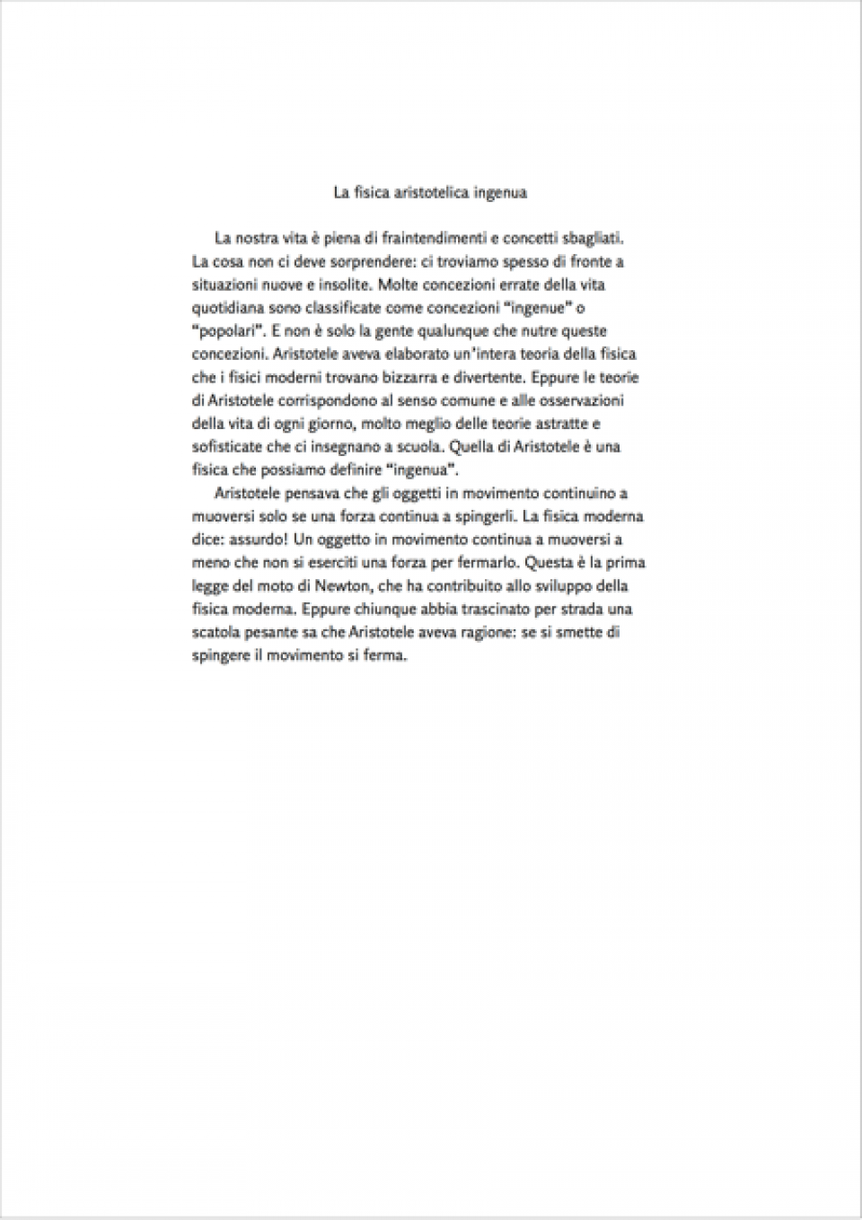
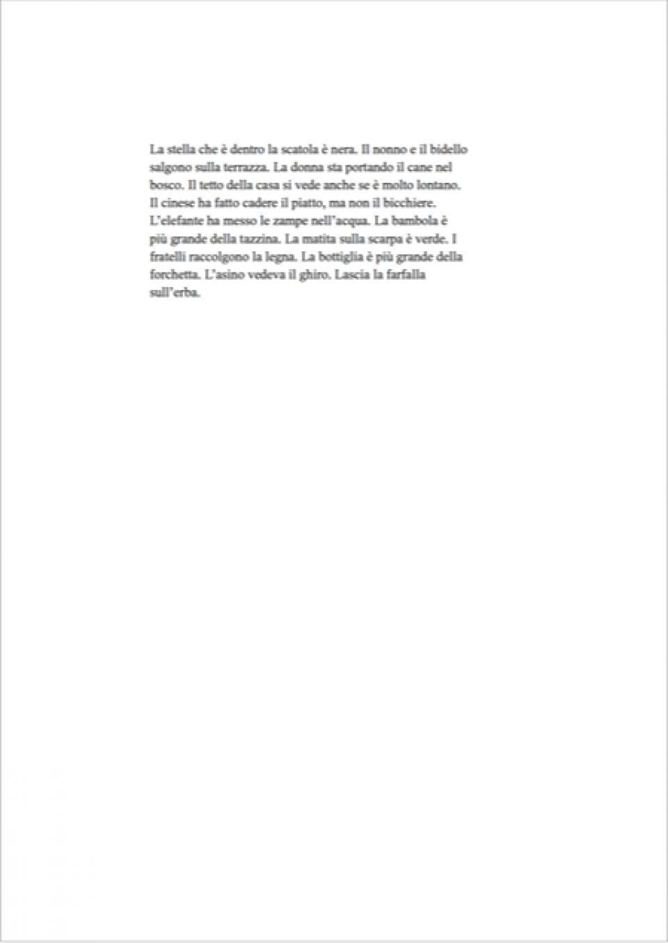
Test 1. Ease of reading assessed at first sight, without reading the text
Each participant was given seven versions of the same passage, set with the seven typefaces selected in the first part of the research. They were asked to arrange the sheets on the table according to ease of reading, assessed at first sight, without reading the text. The best and worst typefaces at first glance were thus identified by each participant.
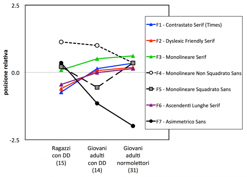
The sanserif with unbalanced contrast (F7) was given a very bad ‘ease of reading’ score by normal readers, while the children with dyslexia gave it a satisfactory ‘easy reading’ score, though lower than the score they gave to the other sanserifs.
For the four seriffed typefaces (F1, F2, F3, F6) the ‘ease of reading’ valuation increased uniformly in line with age and reading experience.
Test 2. Reading aloud
Each participant was asked to read aloud, one after the other, four passages set in the ‘best’ and ‘worst’ typefaces (chosen in test 1) with standard letter spacing and with letter spacing increased by 15%. Each passage was different, but equivalent in terms of length and number of syllables. The number of errors and the time taken to read the text were recorded.
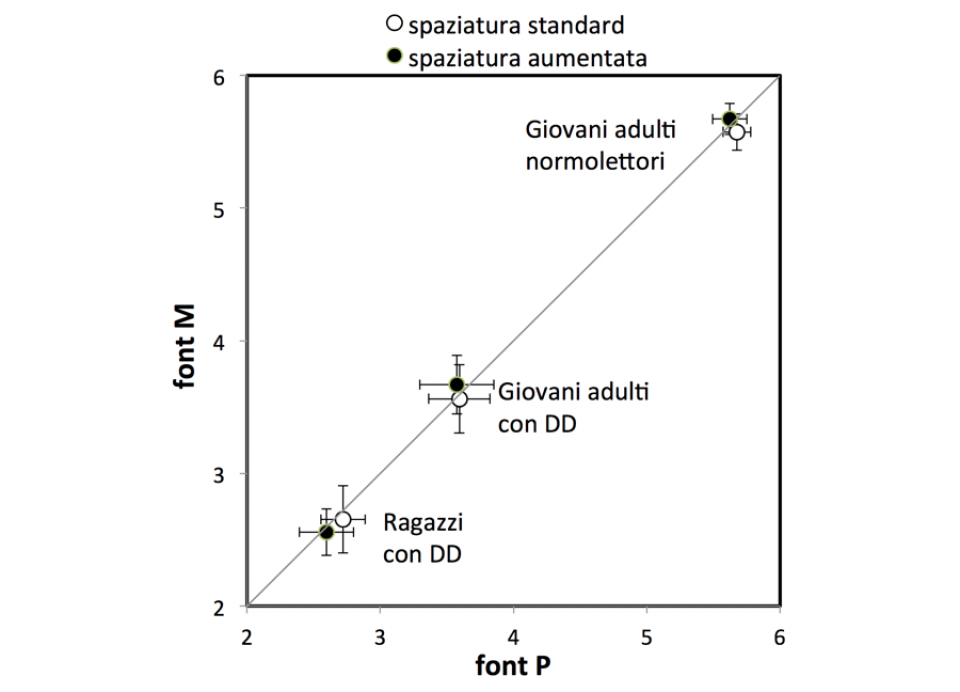
Performance reading aloud did not depend on the typeface used (‘best’ or ‘worst’). Even increasing the spacing between the letters and between words by 15% while keeping the number of characters per line the same did not produce any advantage.
Test 3.1. Lexical decision
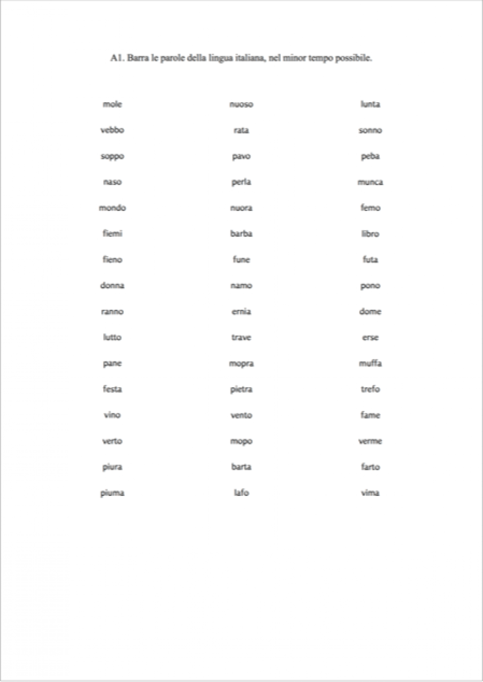
Each Participant had to recognise and put a cross against the Italian words set with the ‘best’ and ‘worst’ typefaces. Each test contained 24 words and 24 pseudo words, created by replacing one or two letters in a word.
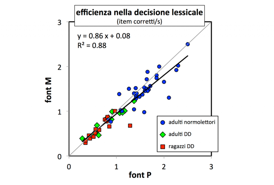
The test had an unexpected result. There was an overall advantage (regardless of reading ability) for the typefaces that participants had selected as ‘worst’ in Test 1. The effect — small but consistent — could be attributed to the more ‘provoking’ characteristics of the ‘worst’ typeface, regardless of the judgement of how pleasant it appeared, which probably determined the choice in Test 1.
Test 3.2. Comparison of strings
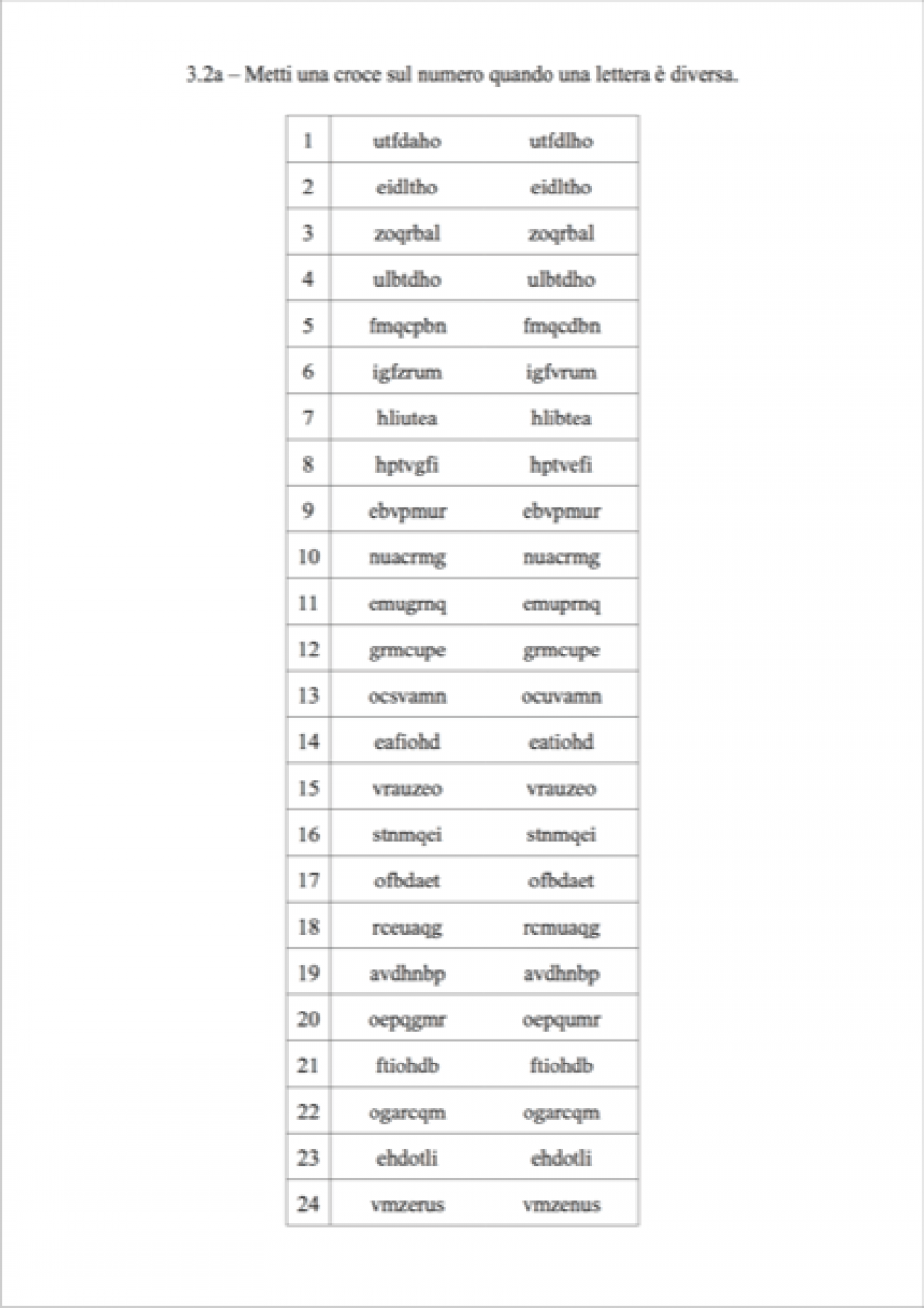
Test 3.2 was designed to assess susceptibility to interference on each letter by neighbouring letters (crowding). The participants had to compare pairs of strings of 7 letters and put a cross against the pairs where one letter was different.
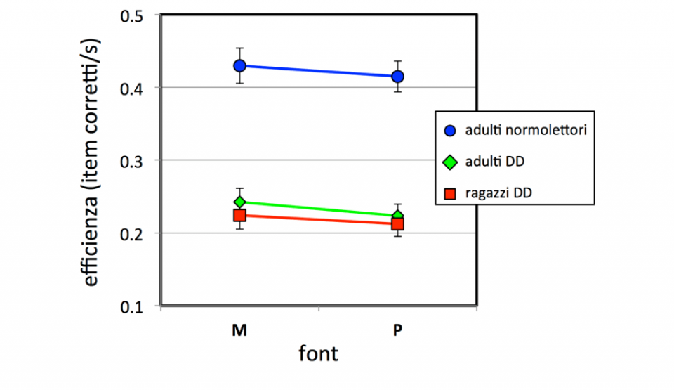
The typeface selected as ‘best’ in Test 1 was slightly better at counteracting crowding in the strings with few syllabic groups.
Conclusions
Overall the four tests showed significant differences among the three samples in reading-related performance. The data collected so far allow us to draw some interesting conclusions.
A typeface chosen at a glance (without reading the text) for its presumed ease of reading does not guarantee better reading performance.
In the reading aloud test, dyslexic readers did not display differences in performance when reading typefaces considered best or worst at a glance or with increased spacing.
In the lexical decision (word recognition) test, the typeface selected at a glance as ‘worst’ produced slightly better reading performances.
Crowding can be counteracted by the typeface selected as ‘best’ at first glance.
For typographic design
With regard to the purpose of the research, which was to identify the characteristics of a type to help people with dyslexia, no objective, clear evidence was found that could point towards using a particular typeface.
It might be that for each specific task (reading aloud, crowding, lexical decision) there is a particular design of type that helps. But reading is a complex experience, where different skills compensate and complement each other to accomplish different tasks.
Perhaps it is precisely these different reading skills that should be welcomed and stimulated, through a typographical solution that does not involve adopting a single typeface.
Thus typography may make its small contribution to reducing that ‘tail end of poor readers inappropriately classified as having a specific disorder’
Beppe Chia
One of Chialab’s main area of interest is the research upon problematic graphic design tools employed as a mean to knowledge access.
This research will continue with studies on the digital tools which assist reading: text-to-speech, e-book reader and typographic configurations.
This research was carried out by:
Beppe Chia, Chialab
Luciano Perondi, ISIA Urbino
Roberto Arista, ISIA Urbino
Giovanni Pignoni, ISIA Urbino
Giammarco Gaudenzi, ISIA Urbino
Walter Gerbino, Dipartimento Scienze della Vita - Università di Trieste
Cristina Burani, ISTC-CNR
Chiara Barbiero, Dipartimento Scienze della Vita - Università di Trieste
Paolo Bernardis, Dipartimento Scienze della Vita - Università di Trieste
Contacts
Beppe Chia beppe.chia@chialab.it
Walter Gerbino gerbino@units.it
Luciano Perondi luciano.perondi@isiaurbino.net
The complete research Tipografia parametrica e Developmental Dyslexia was published in ‘MD Journal’, no. 3 (2017): pp. 88–113. You can read it at this link: download PDF.
Percezione, Azione, Attenzione e Comunicazione (Dipartimento Scienze della Vita - Università di Trieste)
