Metodi e progetti di design per facilitare la comprensione
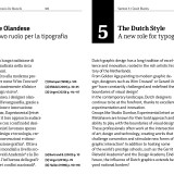
12 Marzo 2025, ore 12:00. Al nostro secondo intervento al ciclo di seminari “Elementi di comunicazione inclusiva” organizzato dal Dipartimento di Architettura dell’Università di Ferrara affrontiamo il vasto tema dell’accessibilità nel progetto grafico di libri cartacei e digitali. Tema estremamente attuale visto che l’EAA (European Accessibility Act) sarà in vigore dal 28 giugno 2025.
Faremo un piccolo excursus delle ricerche più interessanti nell’ambito della lettura e della tipografia, ne seguiremo la ricaduta su alcuni progetti di libri e di materiali stampati. Illustreremo il promettente scenario del digitale con le sue grandi potenzialità che necessitanno di un approccio sempre più integrato tra produzione del contenuto, design grafico e sviluppo.
12 Marzo 2025, ore 12:00
Antonio D’Elisiis, Michele Tomasini, Nicolò Carpignoli, Edoardo Cavazza
Metodi e progetti di design per facilitare la comprensione
Palazzo Tassoni, Ferrara + Streaming
Per partecipare all’evento è necessaria l’iscrizione gratuita a questo link.

Digital haptic interfaces
February 26, 2025, 4:30 pm. At the first day of the seminar series “Elements of Inclusive Communication,” dedicated to low vision and blindness organized by the Department of Architecture, University of Ferrara, we will bring our experience in accessibility design: challenges, research and limitations. We will talk about Tiresia, a project for accessible education, born from a PhD research initiated by Chialab and the IUAV University of Venice, and to date a freely available aid for students and teachers.
Feb. 26, 2025, 4:30 p.m.
Nicolò Carpignoli / Design of digital haptic interfaces.
Elements of inclusive communication
Palazzo Tassoni, Ferrara + Streaming
Free registration is required to attend the event at this link.

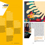
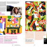
From Illustration to Comics. Pencils in Talented Young Hands / Frankfurter Buchmesse / 2024
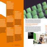
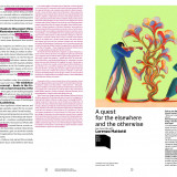
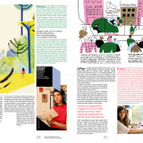
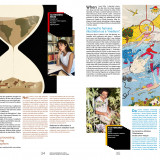
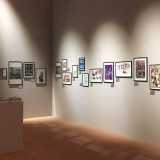
A magazine in the shape of an exhibition catalogue or an exhibition catalogue in the shape of a magazine? We like hybrids, middle ways, diagonals. So we put 30 authors and one master on the pages (and walls) of the Frankfurt Book Fair. An aniconic (or hypericonic) cover with four signs for the four areas in which the 30 talented young hands were selected and grouped by Ivan Canu, Grazia Gotti and Silvana Sola.
Bologna Children’s Book Fair, Bologna Book Plus, Bologna Fiere, AIE.
Roots in the Future – Italy Guest of Honour 2024 Frankfurter Buchmesse.


How do blind people study the moon's orbit?
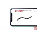
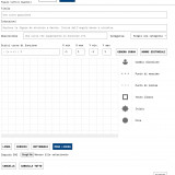
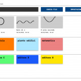
November 28, 2024, 1:00 pm. At Handimatica 2024 we will present Tiresia, an accessible education app dedicated to blind and visually impaired students. Tiresia allows you to build and explore digital tactile figures by taking advantage of vibrations, sounds and speech synthesis, on smartphones and tablets. Geometric figures, function curves, maps of buildings, and conceptual maps can also be used visually, thus creating interaction in studying between sighted and blind people.
Tiresia is a project developed by Nicolò Carpignoli (Chialab) as part of a PhD carried out in collaboration with the IUAV of Venice.
November 28, 2024, 1:00 p.m.
Nicolò Carpignoli / TIRESIA
Handimatica edition 2024 / Innovators of Accessibility: the projects selected by the Call4Projects
Aldini Valeriani Institute
Via Bassanelli, 9/11, Bologna


Bologna Book Fairs
Using the plural is mandatory for the multitude of symbols, icons, brands, illustrations, colors, letters which we design to accompany Bologna’s passion for publishing: Bologna Children's Book Fair, BBPlus, Bologna Licensing Trade Fair/Kids, Bologna Frankfurt, Bologna Shanghai, Bologna Guadalajara, Bologna Angoulême, Bologna Bangkok, Bologna Grand Tour, Illustrators Exhibition, Comics Corner, Self publishing, Awards, Illustrators Survival Corner, BCBF Galleries…
Read more

Reading is a common good
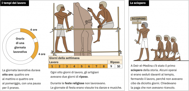
For the Egyptian Museum in Turin and with the Paideia Foundation, we faced the challenge of telling people with special communication needs about the life of the ancient Egyptians. Design obstructions: both individual and group use, print and digital dissemination, self-consistent and cross-reference-free utilization. In page layout, we kept the linearity of the story firm: no menus, no links; only two compositional schemes in the text-image relationship, a minimized number of visual codes for illustrations and typographic styles.
Here the thematic paths “Reading is a common Good”
Deir el-Medina, Il Viaggio dei morti, Il dono del Nilo
Museo Egizio di Torino, Fondazione Paideia.


BCBF24 workshop with Bruno de Almeida
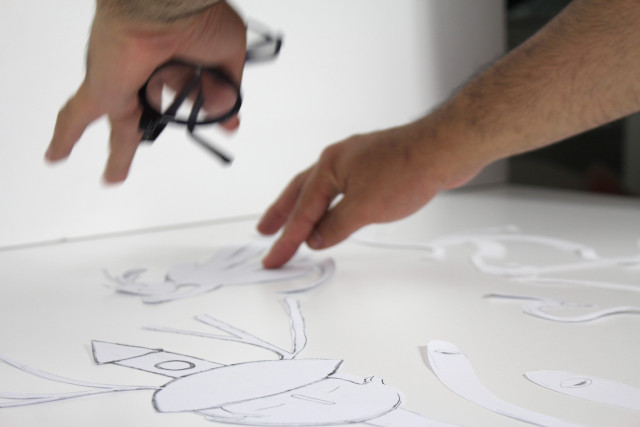
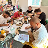
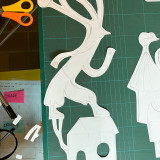
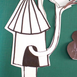
For the 2025 edition of Bologna Children’s Book Fair we teamed up with Bruno de Almeida. The annual VIW (Visual Identity Workshop) took place in June at our place. Many ideas appeared on the table while we met in Bologna, intense discussions went on for the rest of the summer involving everyone on the team. See you in Bologna for the 62nd edition of BCBF, 31 March – 3 April 2025.


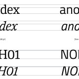
Titillium Serif PRO: first studies
We have released the first studies of the “version_00” of Titillium Serif PRO that follow the sans version in design, vertical proportions and overall dimensions.
The intention is to develop in parallel also a second version in discontinuity with the sans and with features closer to the historical serif canons. We thus trace a double design path with the aim of meeting different editorial needs, without ever losing the identity of the Titillium family and its vertical metrics.
At the moment settle for the sans continuity version. Download it, explore it, and do not demand perfection: still a long way to go and that is precisely why your every observation will be valuable. Thank you!
Download: “Titillium Serif PRO_00” from Chialab GitHub
For reports please write to: titillium@chialab.it
The Tititillium Serif PRO project is part of our Titillium curation efforts and is based on Lorenzo Volpe's thesis, “TITILLIUM SERIF. Research and Typographic Practice,” discussed at ISIA Faenza and supervised by Antonio D'Elisiis.


L’Albertazzi è accademico
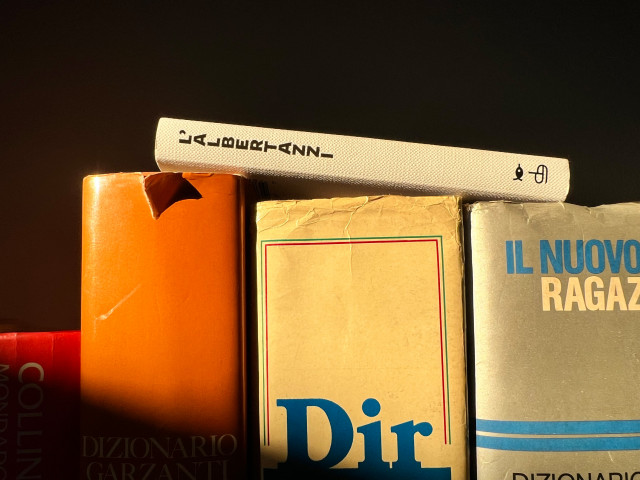
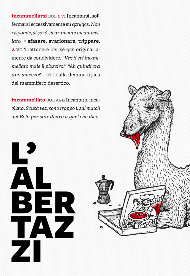
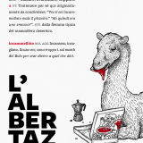
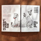
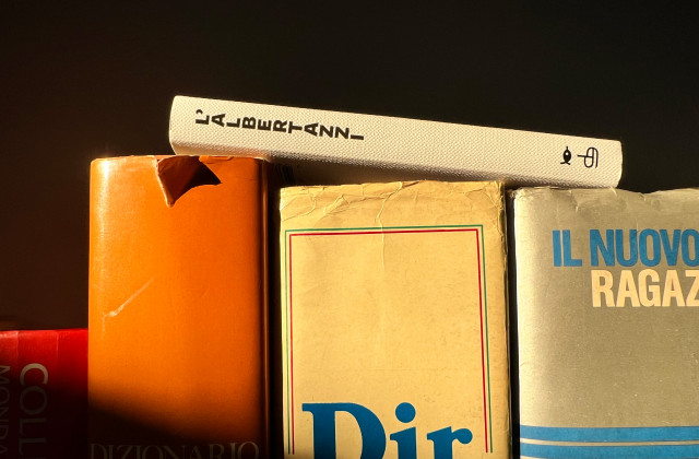
A ottobre 2023 è uscito L’Albertazzi, dizionario illustrato di slang urbano bolognese. È stato incubato e progettato da noi, scritto da Francesco Perlini, illustrato da Valeria Cavallone e Lufo.
Il successo di questo piccolo dizionario ha incuriosito Alberto Ghia, un ricercatore di Linguistica dell’Università di Torino che ci ha regalato una lunga recensione sulla rivista accademica di Lingue e Letterature Moderne “Ricognizioni”.
Tra le righe dell’articolo si può assaporare l’analisi dell’opera più completa e puntuale che fino ad ora abbiamo avuto il piacere di leggere. Se foste curiosi, si trova qui!

Methods and affordance
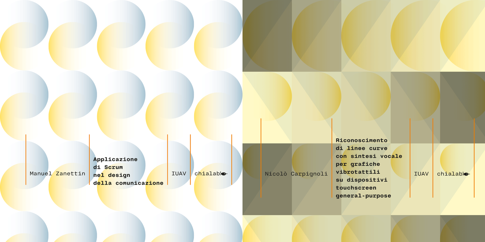
We have two obsessions: making team design of visual artifacts efficient and designing accessible interfaces. These are issues that we deal with in our daily practice and that we have deepened with two industrial Phd papers with the IUAV of Venice. They feature Manuel Zanettin and Nicolò Carpignoli. Manuel analyzed different project management methods to create a new application of the method for communication design while Nicolò designed and prototyped a system to make blind people perceive lines and curves by touch.
Read the research papers:
Managing design projects with Agile methods
Getting blind people to perceive lines of function and geometric shapes by touch and hearing
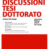
Industrial Phd Thesis Discussions.
Manuel Zanettin, Application of Scrum in communication design.
Nicolò Carpignoli, Curved line recognition with speech synthesis for vibrotactile graphics on general-purpose touchscreen devices.
Speaker: Prof. Luciano Perondi.
Chialab, Iuav University of Venice, Course in Architecture, City and Design.
Design Science.
May 13, 2024, IUAV Venice, Badoer,
Classroom G, 10:30 a.m.


Titillium PRO
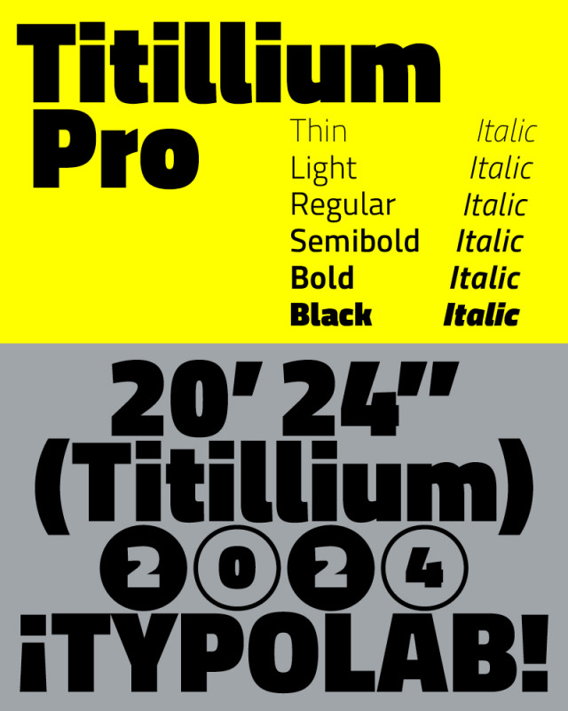
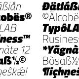
We released under the Open Font License (OFL) an expanded version of Titillium. We did this after years of frequent use collecting desires and critical issues. We did it with the consent of the Urbino Academy of Arts, Marcello Signorile and Luciano Perondi who designed and developed it with students in their courses. We called it Titillium PRO and soon we expect to release, again under OFL license, the serif version!
Download Titillium PRO sans from Chialab GitHub.
Here some more details about the process and features of Titillium PRO.
For reports please write to titillium@chialab.it


Here comes Albertazzi
“L’Albertazzi. Dictionary, grammar, stories of Bolognese slang in a balotta variant“ is an editorial project that we intercepted, enjoyed, incubated and transformed into its visual shape. We did this with Francesco Perlini, author of the book as well as member of the Albertazzi gang, who distorted Bolognese slang into a version of their own.
On several occasions we struggled over typefaces, formats, colours and illustrations (Valeria Cavallone and Lufo) but after three years of work at Chialab we managed to deliver L'Albertazzi! The challenge was to build a cultural landscape, a fresco, a social atmosphere through a non-linear, bouncing way of reading words in alphabetical order that refer to each other.
Will we have succeeded? Who knows. The author and the publisher Pendragon think so and are pinzati da king.
See you at the presentation on Friday 6 October at the Coop Ambasciatori in Bologna.
Enjoy reading!


Explora
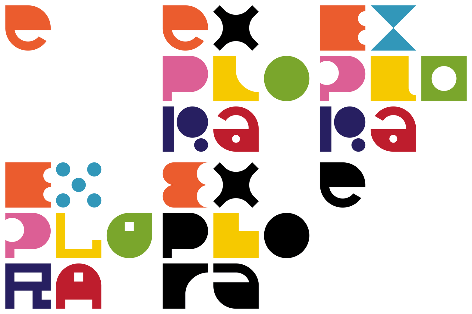
When Explora, Museum for Children in Rome, entrusted us with the redesign of its visual identity, we looked for a way to narrate the great biodiversity of experiences offered by the museum. We found it in 49 intermingling letters, shapes that mutate, iridescent colors. Instead of a monolithic logo, we built a writing system that allows for change, while always remaining recognizable within a family of strong signs that say: all this is Explora – an ever-changing experience, an adaptive identity.

Ripped covers
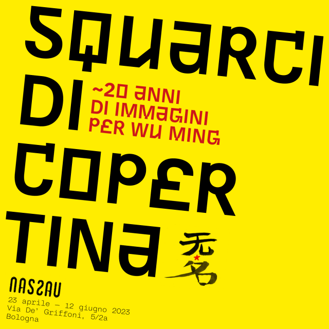
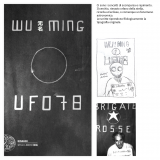
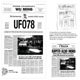
Opening on Friday 23 April at 5pm, the exhibition «Squarci di copertina ~20 anni di immagini per Wu Ming» features covers, posters and in general the graphic art of Chialab applied to the work of Italian writers collective Wu Ming.
On display are sketches and discarded versions of the covers for novels such as L'Armata dei Sonnambuli, Ufo 78, the special 20th anniversary edition of Q, and many more.

BCBF Workshop 2023: plots and twists
Can a single image be created by 20 different people, each with their own characteristic style? Is there such a thing as a collective image or the collective imagination? And if so, can they convey the scenes and characters that BCBF has welcomed and hosted over 60 years in a single unified vision?
This was the completely new challenge the – now consolidated – BCBF visual identity workshop faced when preparing for the 60th edition of Bologna Children’s Book Fair.
This is how it all turned out.

ABABO
We designed and implemented the new website of the Academy of Fine Arts in Bologna.
We started from the contents of the old site, accumulated over more than fifteen years. We identified the new needs and with ABABO staff, organized them into four macro activities: living, studying, opportunities, academy. Each activity helps a user: visitor, student, professor, institution.
Designed for mostly mobile use, the site starts from the Academy's visual identity guidelines, introduces a color code for each area, and uses segments of the logo as an identity watermark.
All editorial content is served by BEdita, our content management system, which regularly synchronizes with the school-administration system APIs developed by Spaggiari Group.
The site can be found HERE.

Feltrinelli Scuola – freshly minted
For two months now, the volumes of the new Feltrinelli publishing proposal for schools, have been in schoolbags, on desks and before the eyes of many students.
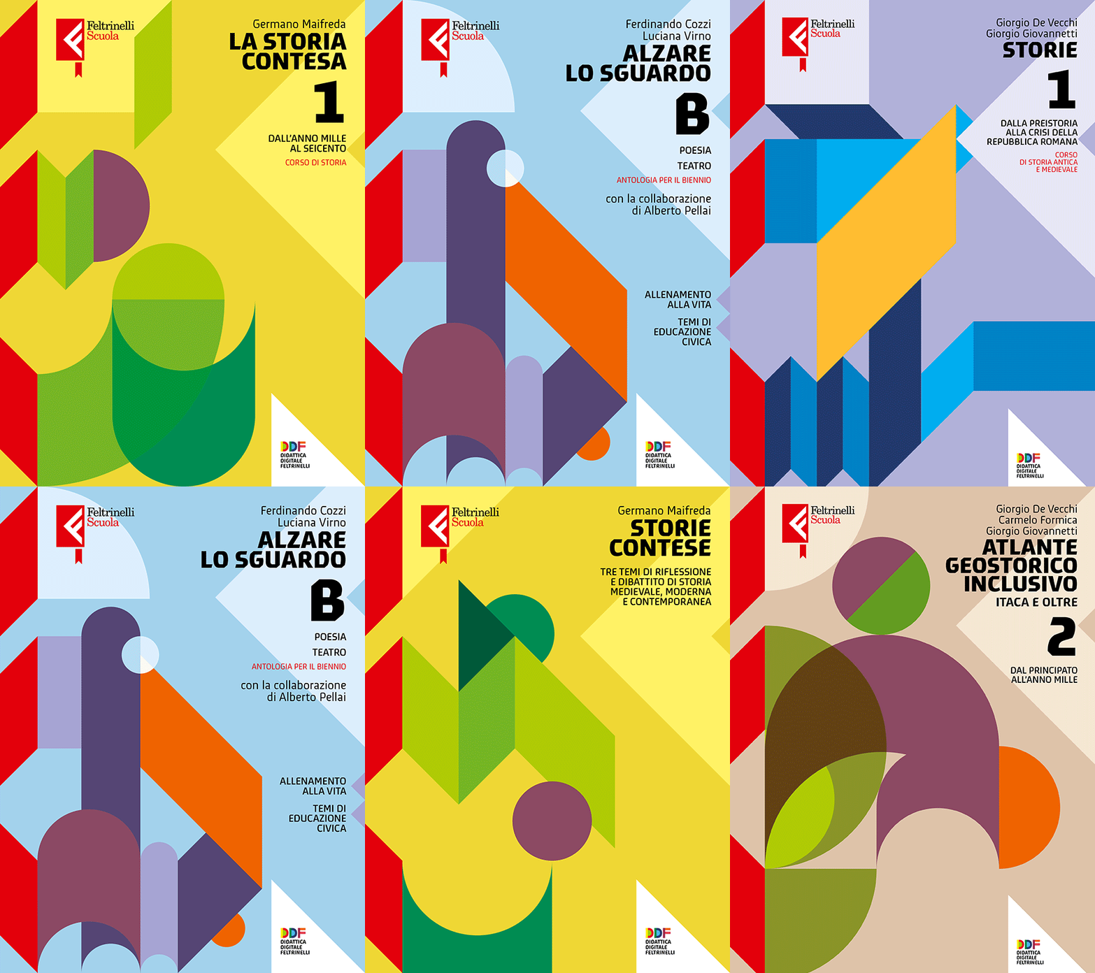
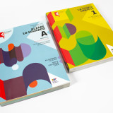
Briefing us for the graphic design, the publisher gave us complete confidence and only two requests: ‘...they must be seen and they must be Feltrinelli...’. As usual we started with obstructions: no photos, no illustrations, no fixed grid, no vignettes, no grotesque. What remained were shapes, colours, a 45° grid based on Bob's red ‘F’, and a typeface, Meran, with its oblique terminals.
Seriality in educational publishing is no joke: the grid has become a real generator of covers. It is not artificial intelligence, but it has allowed us to give character as a single family to some forty volumes of history, literature, grammar, civics.


Giochi di verità
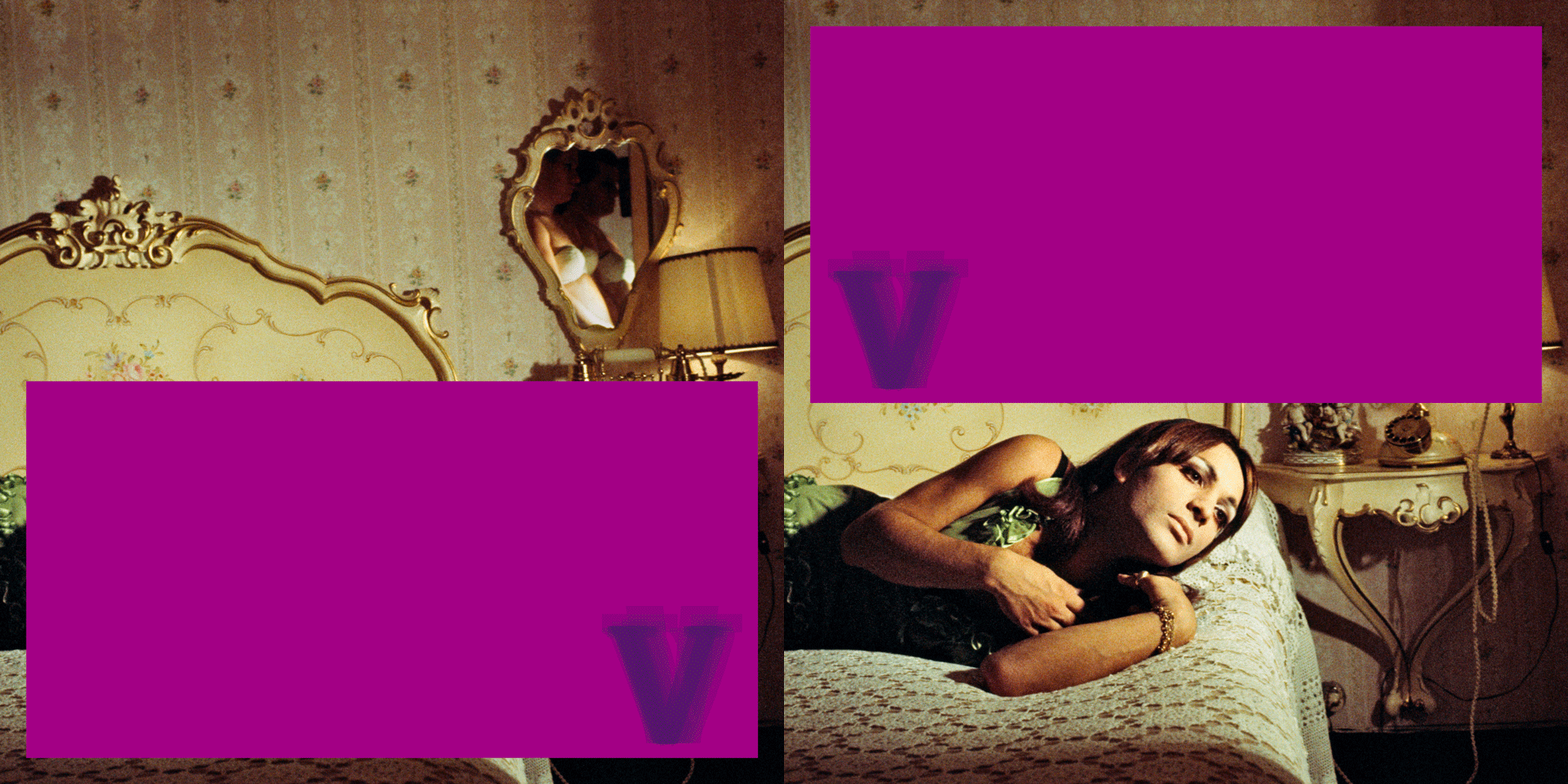
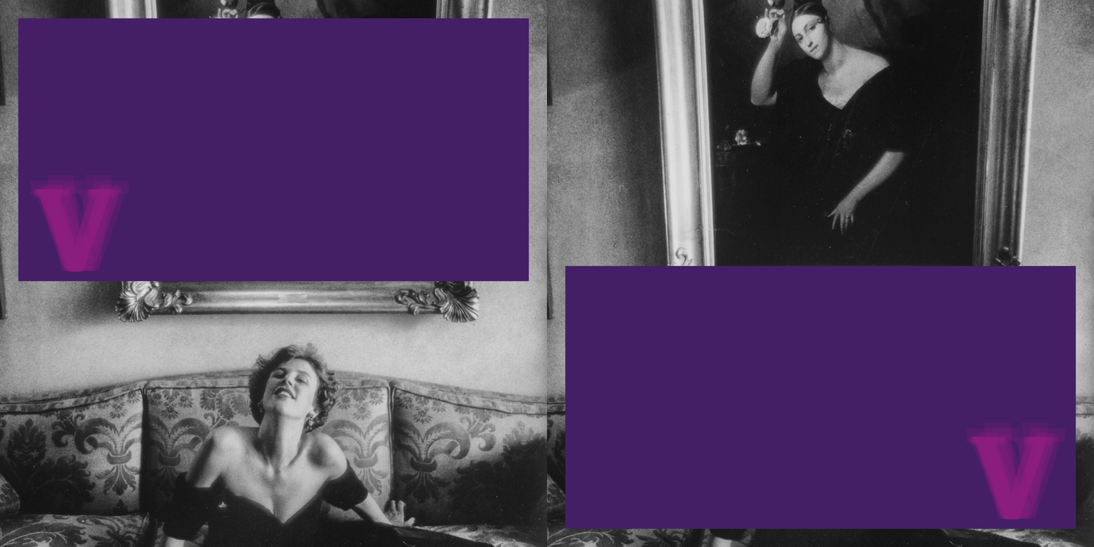
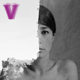
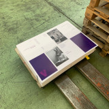
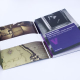
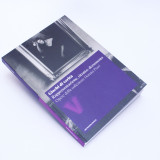
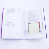
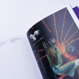
We curated the visual identity of the exhibition Giochi di verità, Truth Games. Over 80 photographs on display in Soliera and a catalog consisting of 160 pages with a poster as an overcover: 17x24cm, composed with GT Sectra, printed on Fedrigoni X-Per paper by Notiziedue.
It was the title that suggested that we divide a photograph into two parts, each revealing its truth. It is the viewer who, by rejoining the parts, can reconstruct a hypothetical, fragile and delicate “photographic” truth. A multiple monogram of “V” as in Verità is the extreme typographic synthesis of this game.
The exhibition curated by Marcella Manni draws on the Donata Pizzi Collection and investigates the relationship between private and collective memory, rituals of family life, role clichés, and experimentation. It is promoted by Comune di Soliera and Fondazione Campori, with contributions from Regione Emilia-Romagna and Fondazione Cassa di risparmio di Carpi.
More info on Giochi di verità. Representation, Portrait, Document.
See the catalog on Metronom shop.


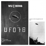
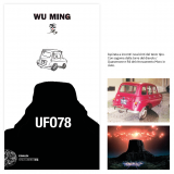
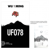
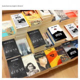
UFO 78
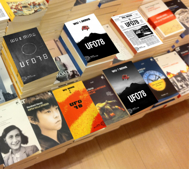
WuMing's latest novel, whose cover we designed, is in the bookstores. We proposed several concepts; R4 N57686 flying in the sky above Mount Quarzerone won. Actually the one we preferred was the first of our submissions, which you can find in the image gallery below. An abduction, squared. But the favorite never wins, it's unavoidable.


BCBF22 Workshop with Sólin Sekkur
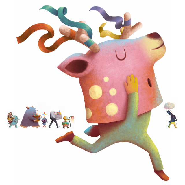
To design the visual identity of the Bologna Children's Book Fair 2022, for the first time totally online, we contacted Mexican illustrator Sólin Sekkur.
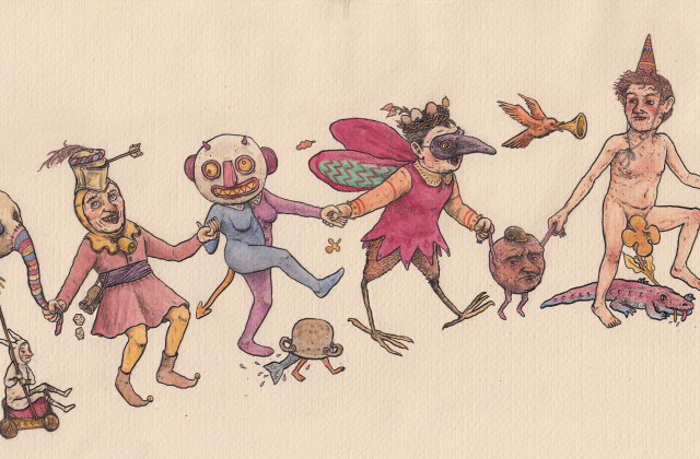
Physically distant due to the constraints of the pandemic but in constant dialogue, the result was a parade of colorful characters ready to celebrate with hope the return of the physical exhibition.
Here is a short story about how things went.
